CASE STUDY
Opening Doors for Artists and Writers
New Gallery | New Branding | New Digital Presence
A Total Renovation
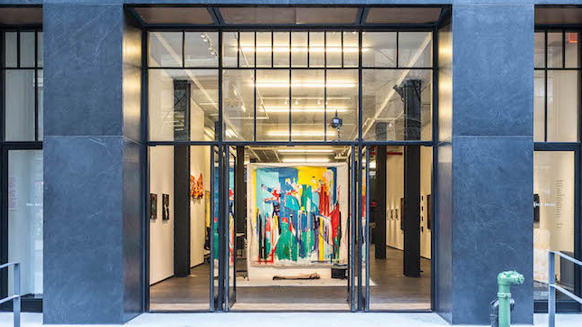
2015 marked a year of transformation for Pen and Brush The organization moved from a townhouse, originally purchased in 1923, to a state-of-the-art gallery. New business processes and technology where needed to support changes in program structure and the launch of a new publishing model. After 120 years, it was also time to update their brand and marketing.
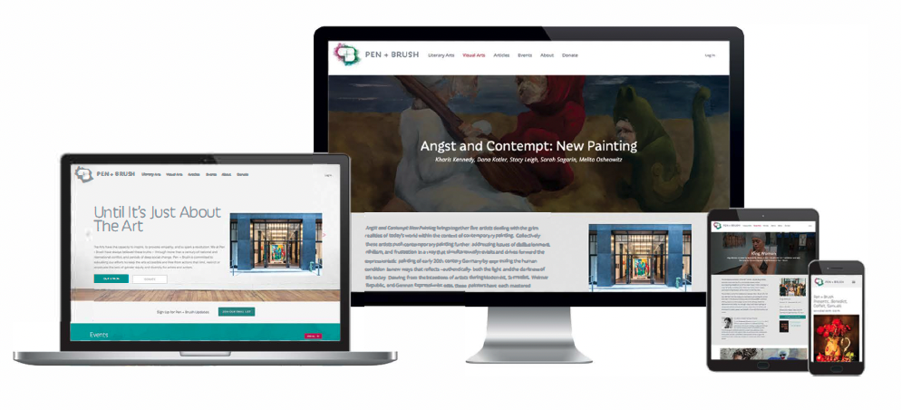
The team created a new brand identity; refined and qualified the operational strategy; formalized the business logic for the new program structure; built a new website and portfolio management platform; implemented new advertising and public relations campaigns.


North America
Industry: cultural heritage non-profit
Location: New York, NY
Size: 4 employees
Website: www.penandbrush.org
Company Bio
Pen + Brush is a 127-year-old publicly supported not-for-profit fighting for gender equity in the arts. P+B provides a platform to showcase the work of women, non-binary and female-identified transgender artists and writers to a broader audience with the ultimate goal of effecting real change within the marketplace.
The Challenge
Pen and Brush has a big mission with a small staff. They needed solutions to automate routine tasks, empower program participants, provide better visibility into workflows, and allow for customization and adaptation as their programs evolve. Their existing technologies were a federated collection of platforms lacking mechanisms for data sharing and interoperability. Despite a rich heritage, the existing brand and marketing were dated and didn’t communicate the forward thinking or contemporary significance of the organization while preserving their historical relevance.
The Approach
The combination of taking on both a physical and a virtual transformation imposed many constrains on this project. We took an iterative approach incorporating multiple deployments tied to the availability of resources. Each release cycle included an in-depth workshop with the client to address validation considerations from the previous release and delivery commitments for the next deployment. We used a model-based design (MBD) approach and object-oriented analysis and design (OOA/D) techniques to maximize efficiency and keep a distributed team in sync.
The Solution
We created a new brand identity and ad campaigns to reinvigorate existing marketing and communications efforts. A CMS driven website and portfolio management application were launched to leverage the two-sided market relationship between creators of works and expert reviewers. This new platform model empowered program participants to take more direct action and freed staff from gate-keeping mundane tasks allowing them to focus their expertise on mission critical activities
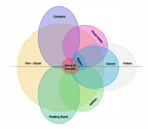
Audience Analysis
Audience analysis revealed symmetries between audience types. Central processes existed but flexibility was required to accommodate unique considerations between workflows for different creative disciplines.
Business Process Design
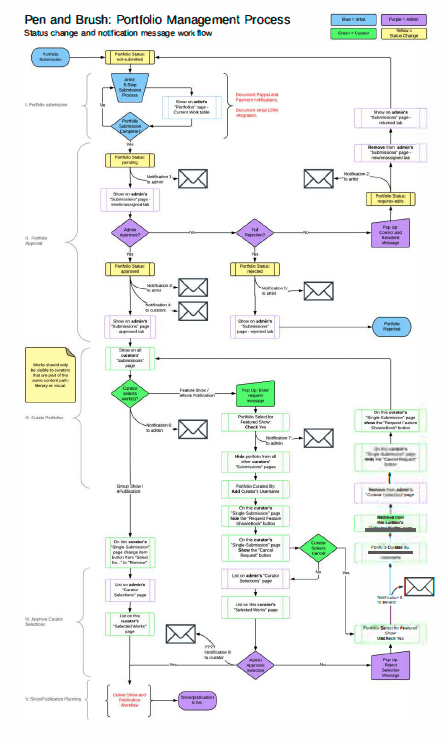
We mapped the central submission, review and selection processes to identify the essential objects, participants and system events necessary for building the a robust portfolio management application.
UX/UI Design and Prototyping
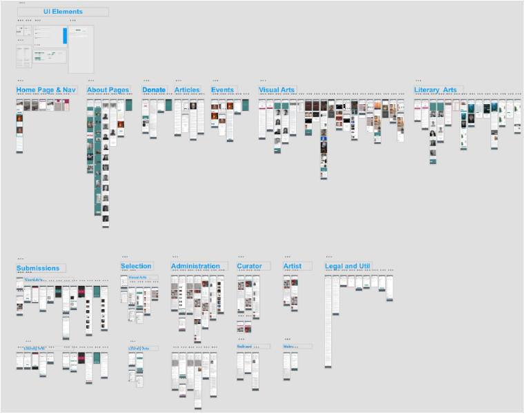
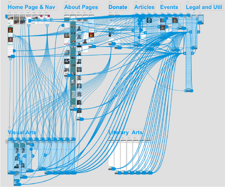
User journeys were mapped and a rapid prototype was created to test the user experience. The process surfaced numerous object states and user pathways that were subtle and easy to overlook without a functional prototype. Common interface elements were defined and applied to the prototype in a mobile-first approach. As a final step before development. the prototype was fleshed out with a complete set of interface designs.
